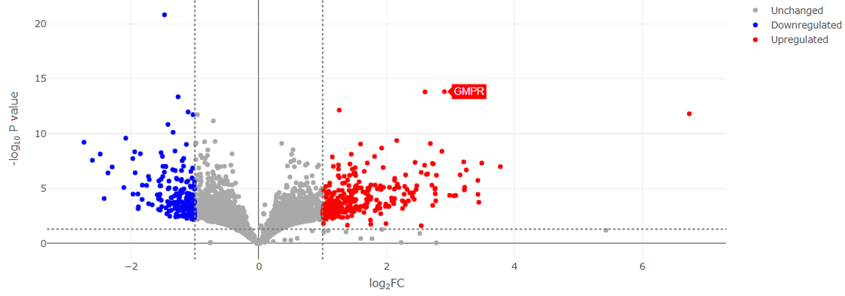
This plot visualizes the results of differential expression analysis, highlighting both the magnitude of change and statistical significance for each gene. Each point represents a gene: the x-axis shows the log2 fold change between groups (indicating up- or downregulation), and the y-axis shows the –log10 of the p-value (indicating significance). Genes farther from the center (larger fold changes) and higher on the plot (more significant) are more strongly differentially expressed. Significantly upregulated and downregulated genes are colored in red and blue, respectively.
