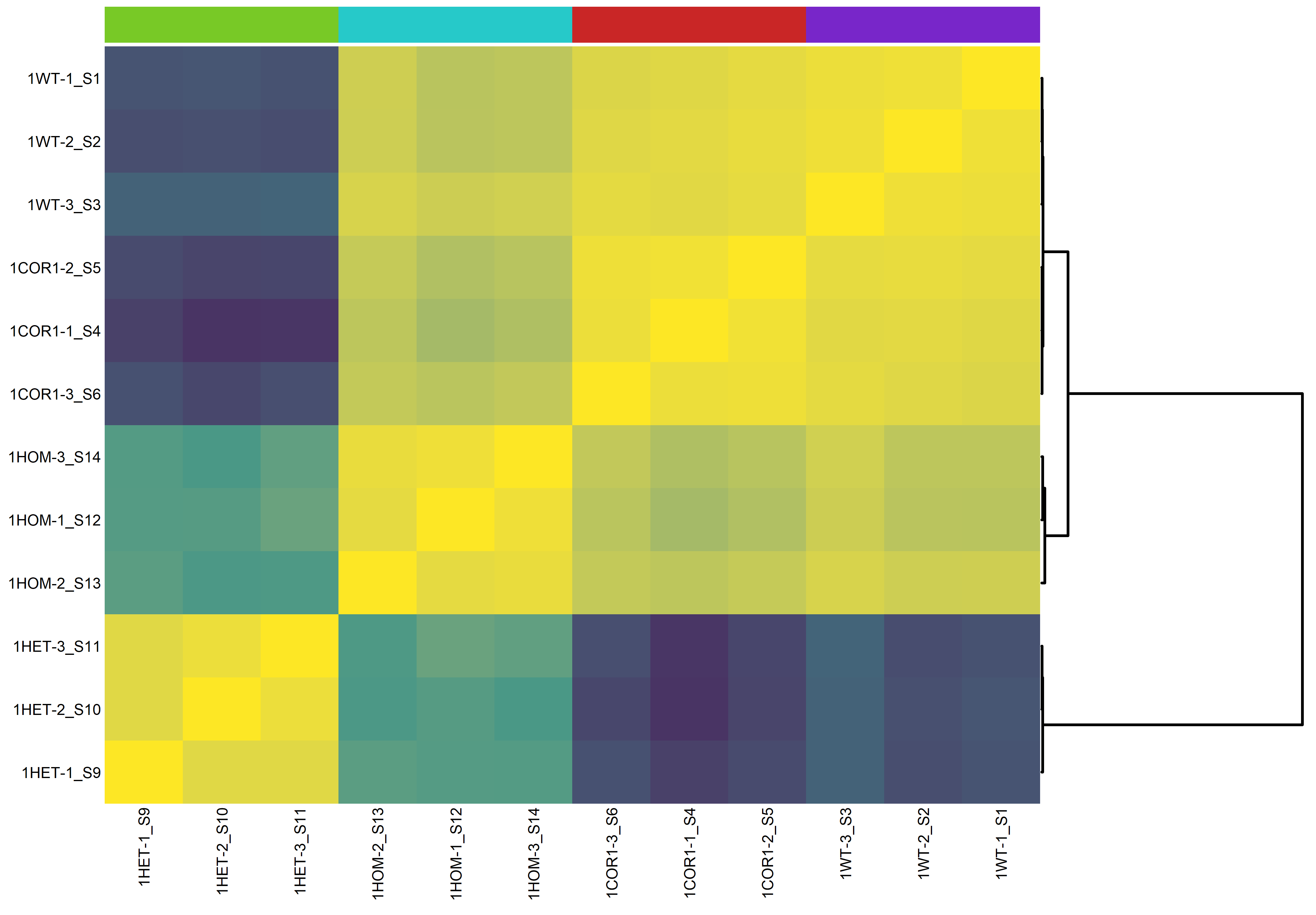
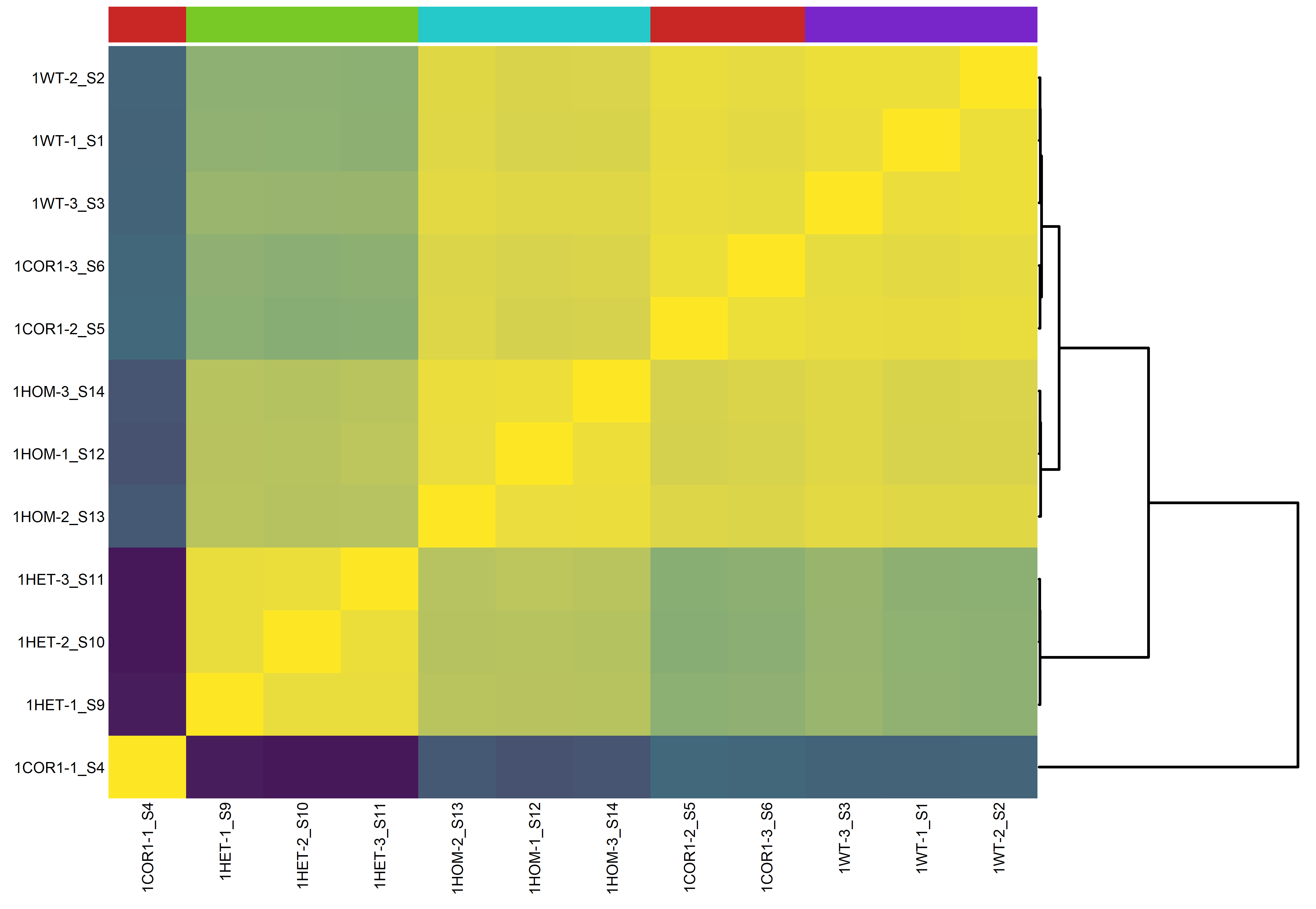
This heatmap shows the pairwise correlation coefficients between all samples, based on their normalized gene expression profiles. Each cell represents the similarity between two samples. High correlations within groups and consistent patterns between replicates indicate good data quality and experimental consistency. This plot is often used as a quality control step to detect potential outlier samples or batch effects.

