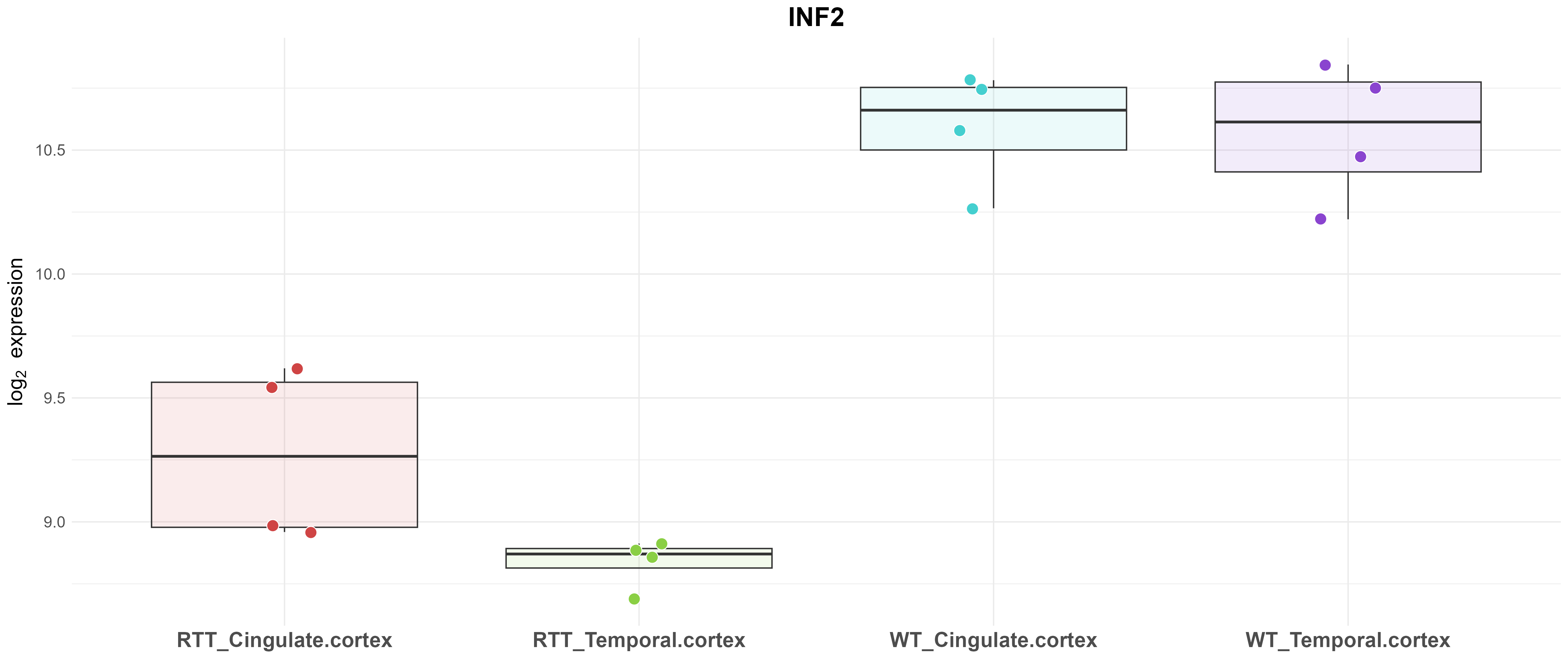
This boxplot shows the expression levels of a single gene across the experimental groups. Each dot represents the expression value (i.e., log-transformed count/intensity) in one sample. The colored boxes summarize the distribution of values within each group: the line inside the box is the median, the box edges show the 25th and 75th percentiles (interquartile range). Use this plot to visually compare the gene’s expression between groups and assess variability within each group.
