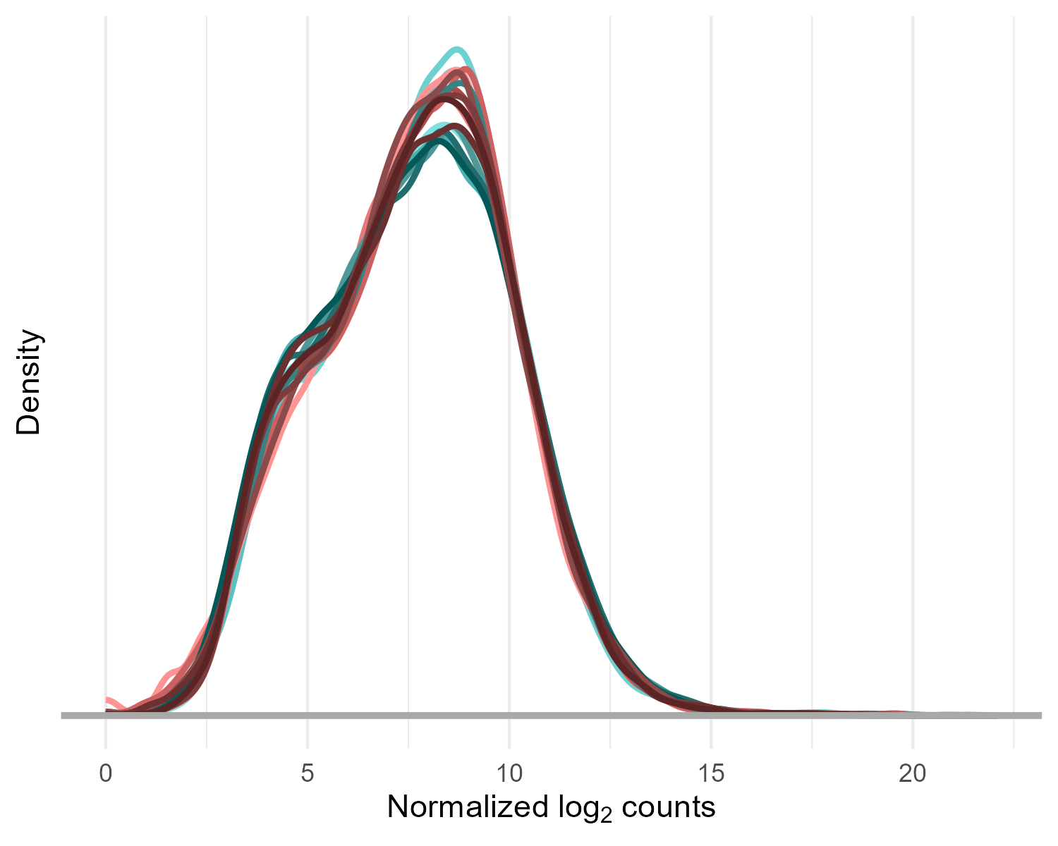
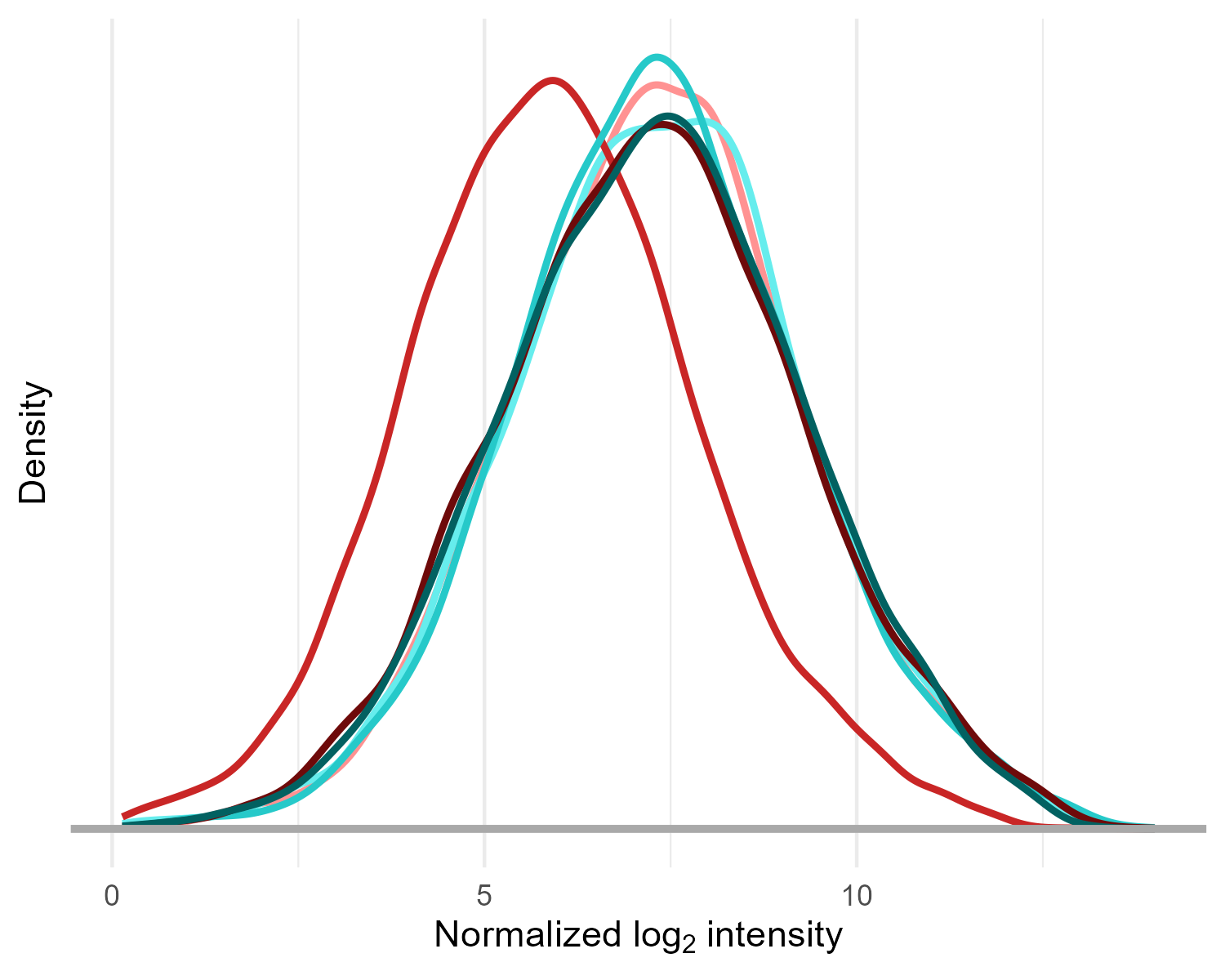
This plot shows the distribution of normalized log-transformed gene expression values across all genes in each sample. Each curve represents one sample, colored by experimental group. The shape of the curves reflects how gene expression values are distributed in the sample. This plot is commonly used as a quality control check to ensure that the overall expression distributions are similar across samples and groups, which indicates consistent data quality and proper normalization.

